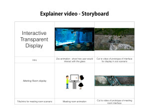
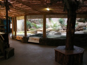
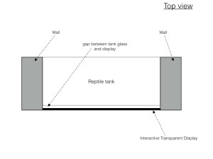
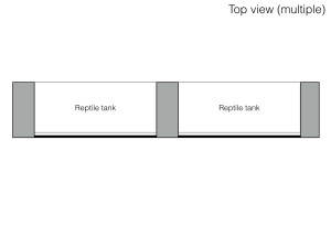
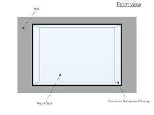
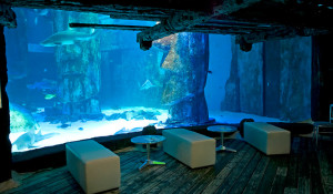
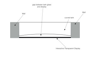
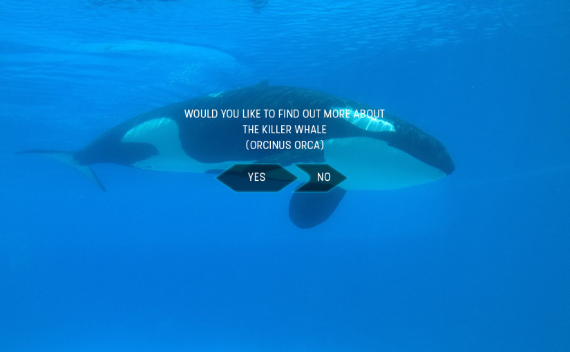
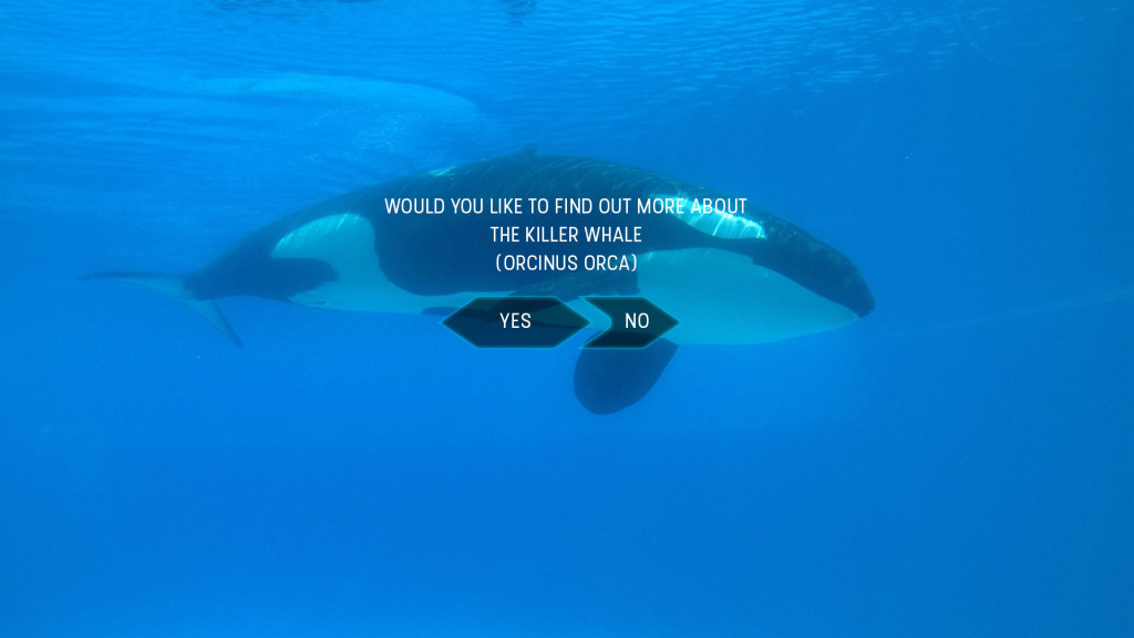
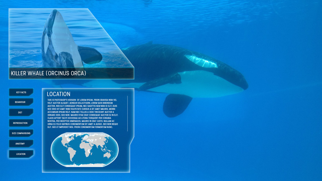
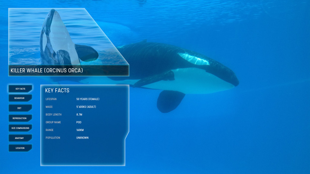
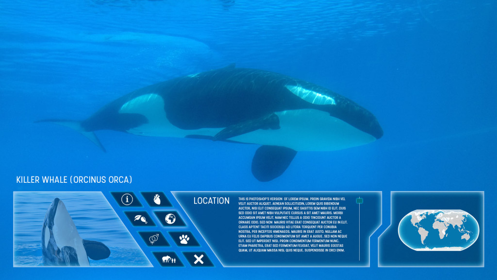
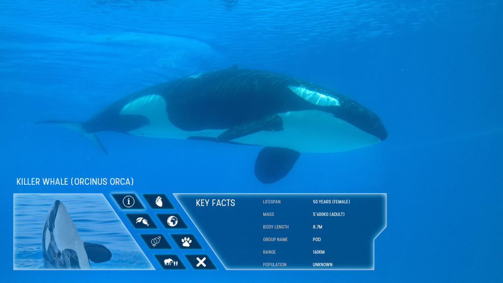
First Wireframes of the Zoo Interactive Transparent Display design. The idea is what the user will see if at a sea world centre watching a killer whale underwater. The concept could be transferred to a vast number of different animals on land or at sea.
Initial Log on screen once user interacts with screen
 Original Design displayed content on users left in order to continue to view the animal in question

 However will need to identify whether the content could be to much of a distraction in this location, therefore an alternative method is created displaying the content below the main attraction.

 The next possible step is to create an HTML mock-up prototype of the UI for user testing. This will hopefully identify a number of potential issues and resolutions including colour over different backgrounds, whether left display or bottom display is better, is the content generally a distraction or not etc.
