So far I have modelled a character with polygon. I started modelling with a polygon and I also applied some basic techniques1 such as extrude, and UV mapping.
I have attached a presentation with more detail.
So far I have modelled a character with polygon. I started modelling with a polygon and I also applied some basic techniques1 such as extrude, and UV mapping.
I have attached a presentation with more detail.
httpss://www.youtube.com/watch?v=m933lfMzjpU
Handheld transparent devices offer all sorts of possibilities. In the context of this project, in particular for the meeting room design, they can be used in conjunction with the Solstice Pod. As shown in the above video, a transparent mobile device like the tPad has clear advantage over a regular tablet.
I have completed the written parts of the design document for the Zoo gamification, and I will endeavour to create or find visuals to complete it. As you can see from the screenshot below I have indicated where I want the images to be and what of. The whole document will be made available on Google docs.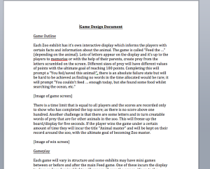
The Solstice pod by Mersive allows users to collaborate by linking multiple devices to one display.
httpss://www.youtube.com/watch?v=OuJ32aW9Hz8&feature=youtu.be
The design for the meeting room scenario took this into account. By having the display on a rotating stand users are able to actively collaborate while still being able to see each other. The integration of the solstice pod means that users are able to share their desktop without having to move from their position.
The enclosures used in zoos are usually just variations of glass tanks with frames. As visitors generally include children, the displays need to be accessible to them as well.
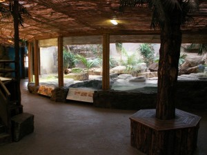
The proposed design places the Interactive Transparent Display directly in front of the glass case housing the animals and a gap is left between the display and the glass. In theory this should reduce potential distress caused to the animals by the noise from touching or knocking on the display.
In regards to enclosures with curved glass such as those for aquariums, the display would still sit in front of the glass.
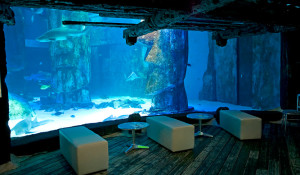
However, the law of refraction will need to be taken into consideration to ensure that the visitor does not see an overly distorted version of the contents of the tank.
First Wireframes of the Zoo Interactive Transparent Display design. The idea is what the user will see if at a sea world centre watching a killer whale underwater. The concept could be transferred to a vast number of different animals on land or at sea.
Initial Log on screen once user interacts with screen
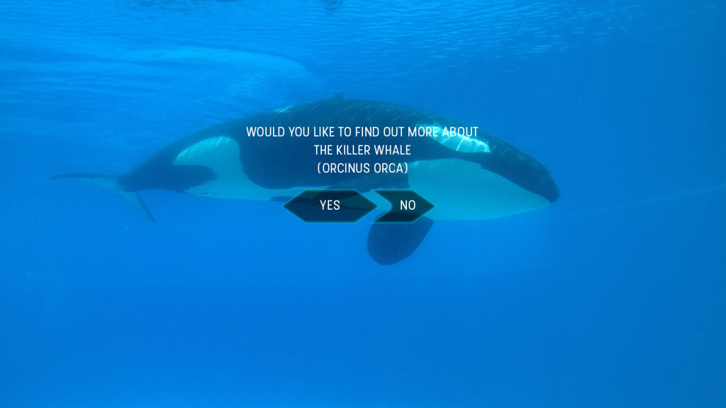 Original Design displayed content on users left in order to continue to view the animal in question
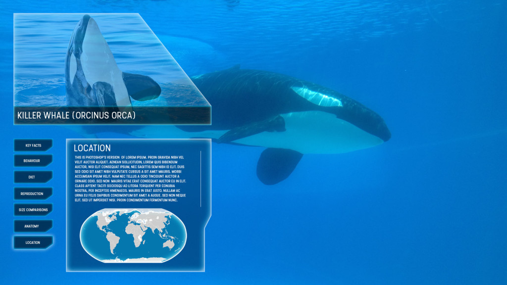
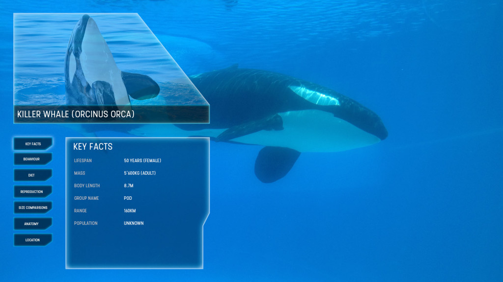 However will need to identify whether the content could be to much of a distraction in this location, therefore an alternative method is created displaying the content below the main attraction.
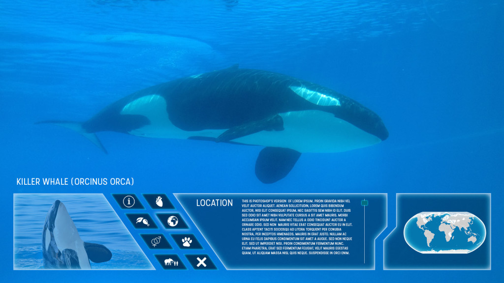
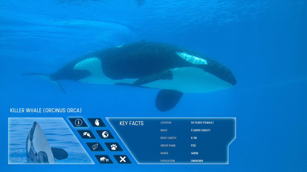 The next possible step is to create an HTML mock-up prototype of the UI for user testing. This will hopefully identify a number of potential issues and resolutions including colour over different backgrounds, whether left display or bottom display is better, is the content generally a distraction or not etc.
The following dates have been agreed on for the completion of the project deliverables:
In order to understand the current scenarios faced within a meeting environment to identify a good use for Interactive Transparent Displays I have created a survey to find out more.