UI Corporate Environment

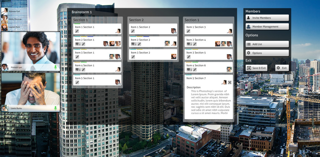
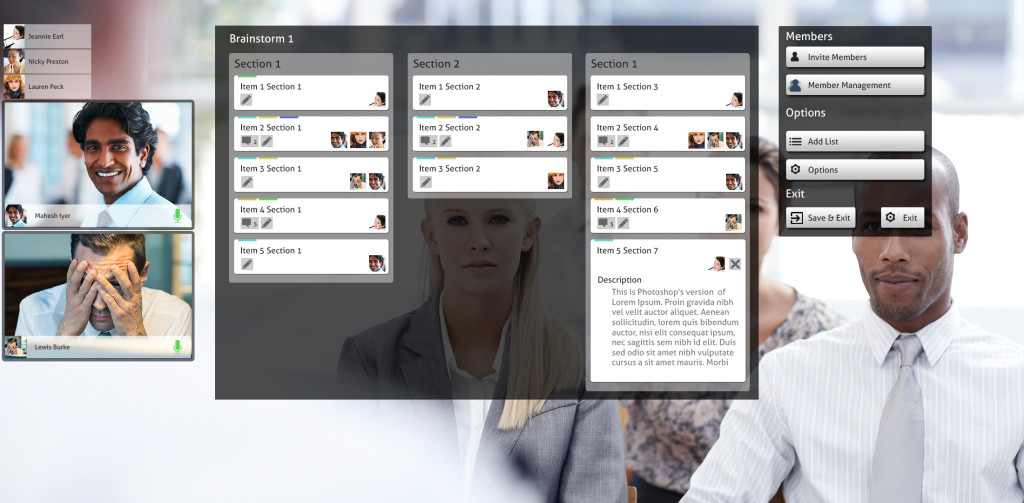
Here are a couple of UI designs for the corporate environment, the idea is using a brainstorming, project management activity with the idea that users can also access remotely through conference calling as well as interacting with the display directly.

The first scenario displays using it as a window display.

corporate_city

In this environment though is whether if something outside happened would it be a distraction to the main activity?

The second example is a meeting room environment, a more likely scenario

corporate_office

UI Prototype Mk2

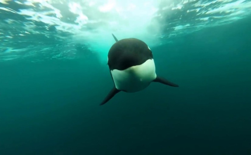
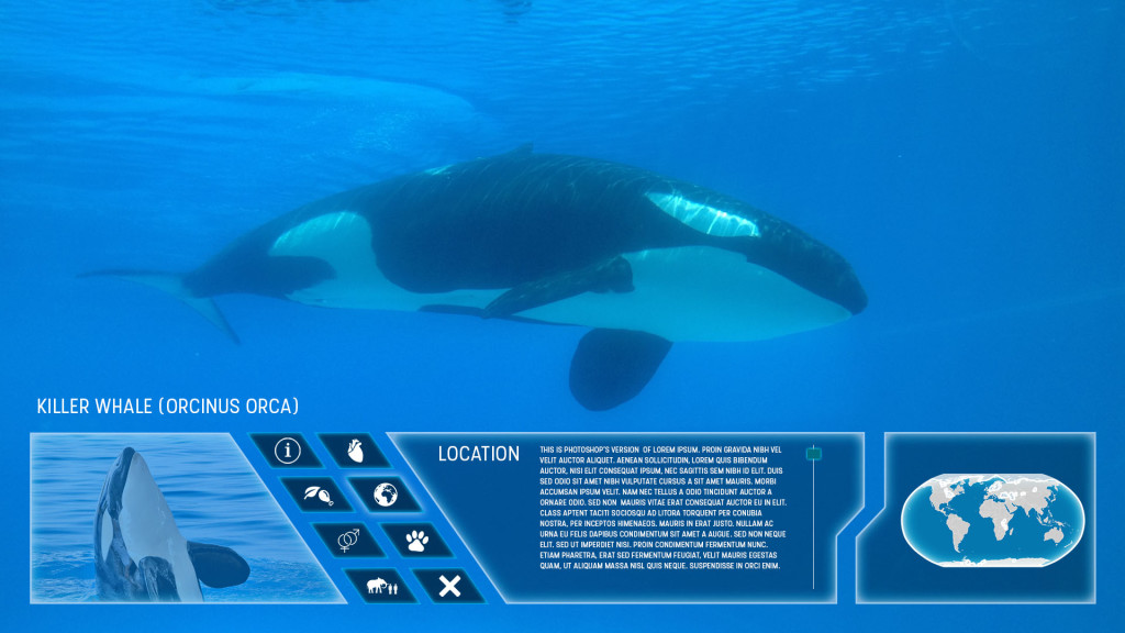
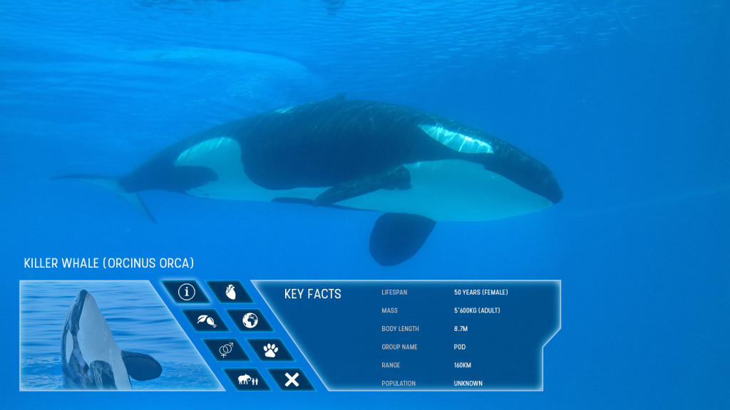
To come inline with the intended final demonstration an alternative version of the UI prototype has been created featuring Killer Whales.

https://uni.blue-phoenix.co.uk/DSP/whale.html

This also demonstrates that the UI can be used in both underwater and land scenarios which I intend to test both to get feedback on the user experience within the prototype.

Key Notes

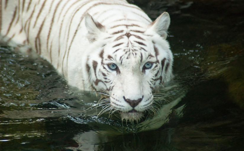
  • The video on this page is slightly larger than the tiger version, therefore expect a slight longer download time.
  • This has been breiefly tested on the latest versions of Firefox, Chrome and Edge. It is not guarenteed that the demonstration will be as smooth on older browsers.

Zoo UI Prototype

Here’s a link to the HTML zoo prototype which is planned to be used to demonstrate the UI design but also for user acceptance testing to find out if the UI achieves what users would expect in the zoo environment.

https://uni.blue-phoenix.co.uk/DSP/

Couple of key notes

  • The display is designed to be on a screen size of 1920 x 1080 or larger. It can be viewed on smaller however the experience would not be considered accurate
  • Please allow a short time for the background video to start working.

Zoo UI Design

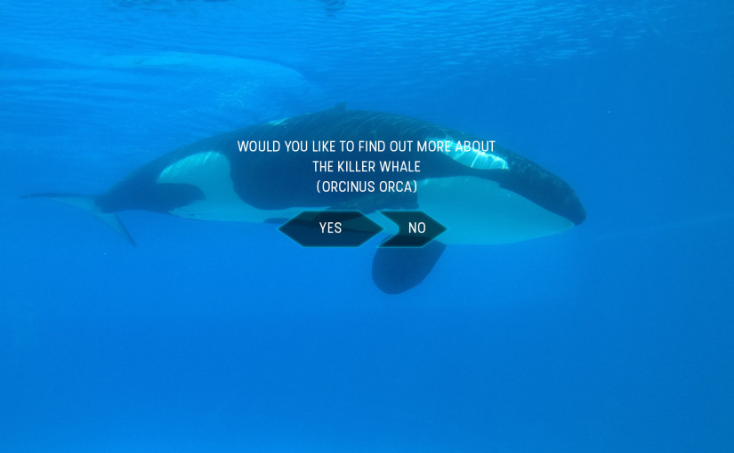
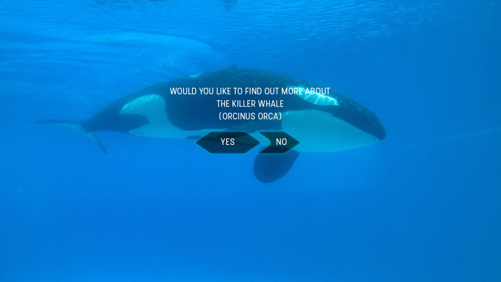
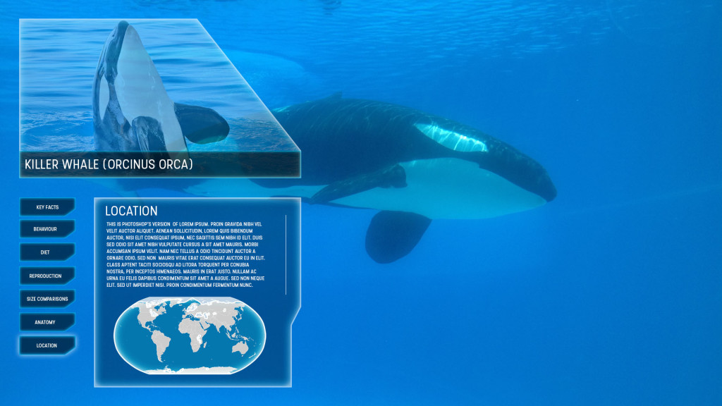
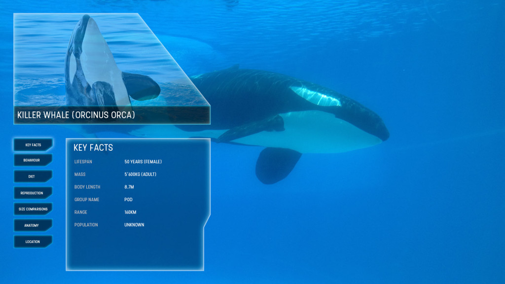
First Wireframes of the Zoo Interactive Transparent Display design. The idea is what the user will see if at a sea world centre watching a killer whale underwater. The concept could be transferred to a vast number of different animals on land or at sea.

Initial Log on screen once user interacts with screen

zoo_wireframe_0000_StartOriginal Design displayed content on users left in order to continue to view the animal in question

zoo_wireframe_0002_Size zoo_wireframe_0001_Main InfoHowever will need to identify whether the content could be to much of a distraction in this location, therefore an alternative method is created displaying the content below the main attraction.

zoo_wireframe_0004_Horizontal Location zoo_wireframe_0003_Horizontal Main InfoThe next possible step is to create an HTML mock-up prototype of the UI for user testing. This will hopefully identify a number of potential issues and resolutions including colour over different backgrounds, whether left display or bottom display is better, is the content generally a distraction or not etc.