UI Corporate Environment

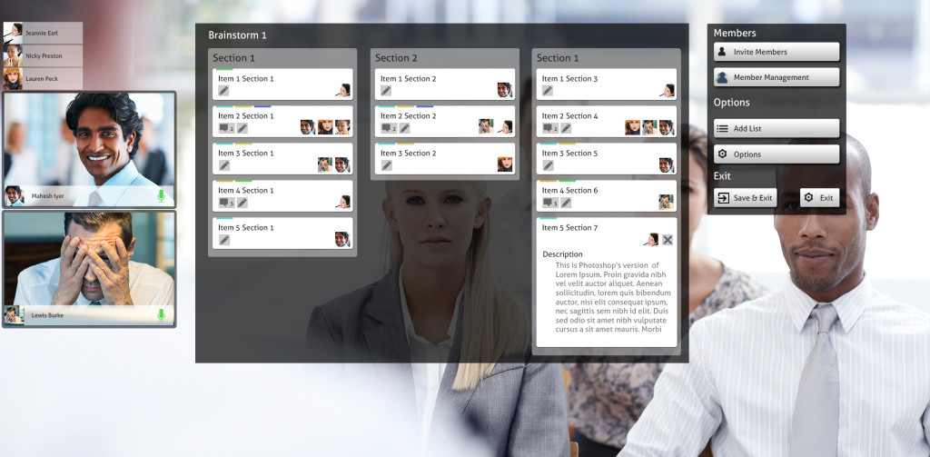
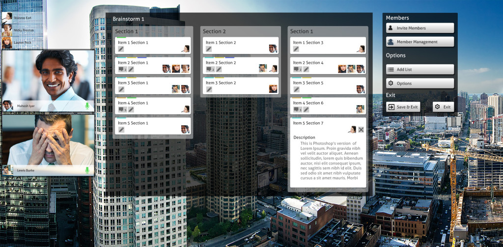
Here are a couple of UI designs for the corporate environment, the idea is using a brainstorming, project management activity with the idea that users can also access remotely through conference calling as well as interacting with the display directly.

The first scenario displays using it as a window display.

corporate_city

In this environment though is whether if something outside happened would it be a distraction to the main activity?

The second example is a meeting room environment, a more likely scenario

corporate_office

UI Prototype Mk2

To come inline with the intended final demonstration an alternative version of the UI prototype has been created featuring Killer Whales.

https://uni.blue-phoenix.co.uk/DSP/whale.html

This also demonstrates that the UI can be used in both underwater and land scenarios which I intend to test both to get feedback on the user experience within the prototype.

Key Notes

  • The video on this page is slightly larger than the tiger version, therefore expect a slight longer download time.
  • This has been breiefly tested on the latest versions of Firefox, Chrome and Edge. It is not guarenteed that the demonstration will be as smooth on older browsers.

Zoo UI Prototype

Here’s a link to the HTML zoo prototype which is planned to be used to demonstrate the UI design but also for user acceptance testing to find out if the UI achieves what users would expect in the zoo environment.

https://uni.blue-phoenix.co.uk/DSP/

Couple of key notes

  • The display is designed to be on a screen size of 1920 x 1080 or larger. It can be viewed on smaller however the experience would not be considered accurate
  • Please allow a short time for the background video to start working.

Zoo UI Design

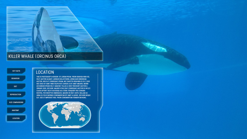
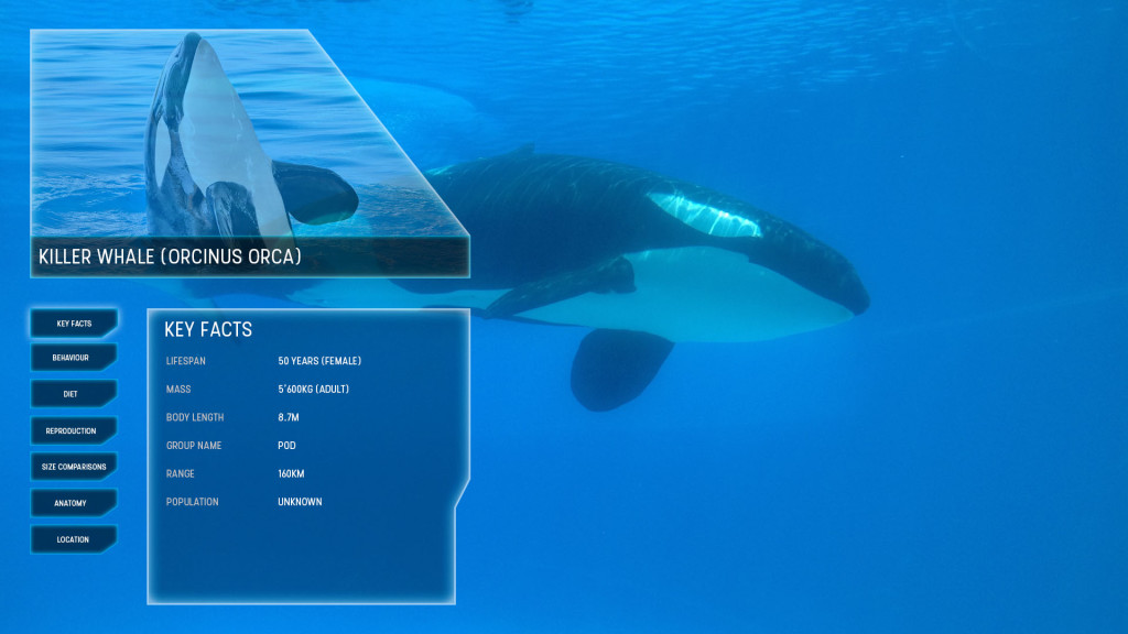
First Wireframes of the Zoo Interactive Transparent Display design. The idea is what the user will see if at a sea world centre watching a killer whale underwater. The concept could be transferred to a vast number of different animals on land or at sea.

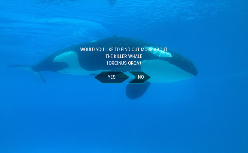
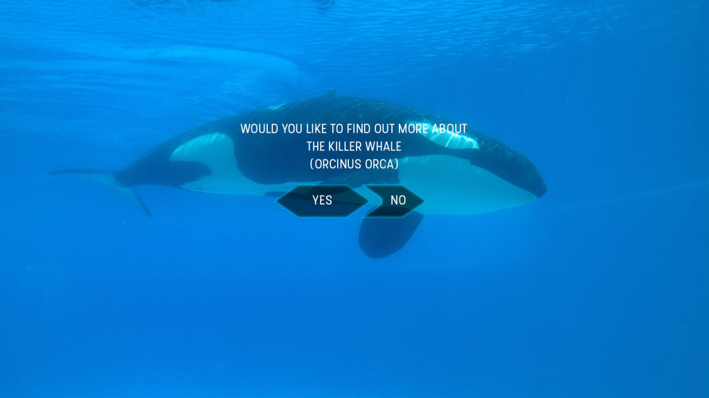
Initial Log on screen once user interacts with screen

zoo_wireframe_0000_StartOriginal Design displayed content on users left in order to continue to view the animal in question

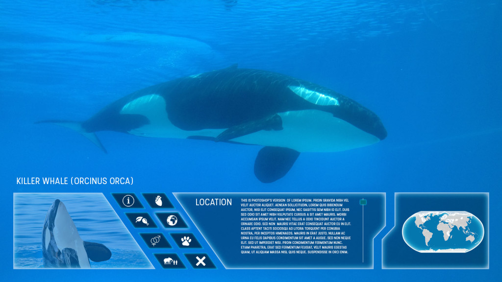
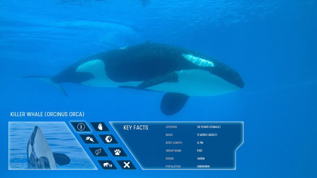
zoo_wireframe_0002_Size zoo_wireframe_0001_Main InfoHowever will need to identify whether the content could be to much of a distraction in this location, therefore an alternative method is created displaying the content below the main attraction.

zoo_wireframe_0004_Horizontal Location zoo_wireframe_0003_Horizontal Main InfoThe next possible step is to create an HTML mock-up prototype of the UI for user testing. This will hopefully identify a number of potential issues and resolutions including colour over different backgrounds, whether left display or bottom display is better, is the content generally a distraction or not etc.

UI of Interactive Transparent Displays – Explicit

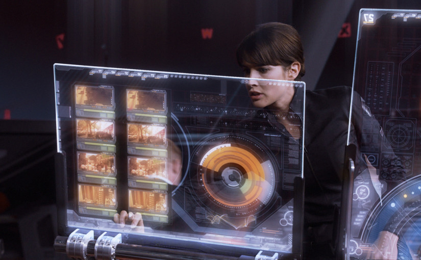
The Minority report video displayed in a post earlier in the blog showed a good example of an ‘explicit’ display, and how the content on the screen is the main focus for the user.

The key element is the level of transparency on each UI element and how it remains the centre of focus despite the ability to see things beyond the screen.

The video below shows a good example of that level of transparency and how a small level of collaboration can be incorporated into the design.

httpss://youtu.be/g7_mOdi3O5E?t=1m12s

Iron Man and the Avengers UI also shows in some aspects a good level of transparency in their screens.

httpss://youtu.be/YAXsZphpiu8?t=1m28s

The collaboration aspect of the interaction is still somewhat of an enigma, does the user see a reflection or a transparent image of what is being worked on? Does the screen focus on what item or is their the ability to multitask?

As far as the Interacting with the displays are concerned, this can be used similar to a tablet or smart phone touch screen using Gesture UI.

UI of Interactive Transparent Displays – Implicit

The concept of Interactive Transparent Displays is not one that is recent, for example the Head Up Displays (HUD) in aircraft first arrived in the 1950’s in which assisting data was placed on a transparent screen to aid the pilot to achieve their objectives with far greater efficiency, however it is not one that has been widely used in the commercial world.

Technology has advanced to include the Optical Head Mounted Display (OHMD) like the Google Glass, and Helmet Mounted Display (HMD), once again used more for the aviation world.

From what I would expect, these forms of transparent displays I would consider to be ‘implicit’ displays.

My explanation for a ‘implicit’ display would be a display that provides additional information as a subset of your main focus.

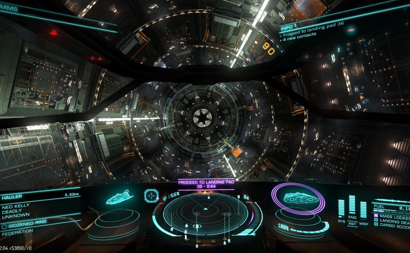
Games use these types of HUD’s quite frequently allowing users to concentrate on their objectives while still providing valuable information. Positions of these various pieces of vital information are either at the bottom or top of the display, the more important information appears to feature more prominently at the bottom, however this may require investigation.
Elite Dangerous DisplayHalo 5 Display

This is starting to appear in some car technology as well for example some BMW’s are starting to have this included in their designs.

httpss://youtu.be/ZiUUTcrmhII

How can these ideas be incorporated into a Meeting Interactive Display? As meeting content will be more explicit it is difficult to say, but does a meeting have to consist of just one display? Can each individual have their own OHMD which provides additional information to aid in the overall development of the meeting?

It’s important to understand how information on these displays can be placed on the screen without causing a distraction to main content or discussions.

Minority Report Touchscreen

Here’s a basic version of a ‘transparent touchscreen’ just to get some concept ideas going.

httpss://youtu.be/isb9wBCJGwc

Based on the touchscreen display used in the film Minority Report

httpss://youtu.be/7SFeCgoep1c

Considering the film was made in 2002 the idea when it came out was considered futuristic. Now though… seems like the idea is becoming reality, but could it really be used in this format?