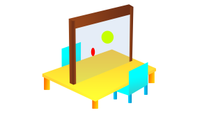
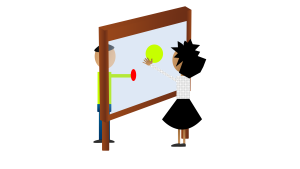
Currently the two environments we propose to use the Interactive Transparent Display are:
- Education

- Commercial

The Minority report video displayed in a post earlier in the blog showed a good example of an ‘explicit’ display, and how the content on the screen is the main focus for the user.
The key element is the level of transparency on each UI element and how it remains the centre of focus despite the ability to see things beyond the screen.
The video below shows a good example of that level of transparency and how a small level of collaboration can be incorporated into the design.
httpss://youtu.be/g7_mOdi3O5E?t=1m12s
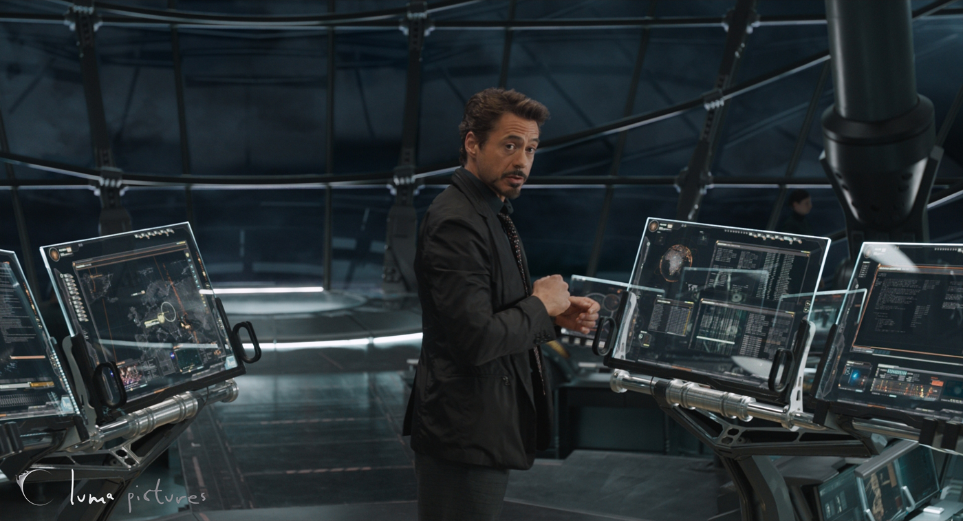
Iron Man and the Avengers UI also shows in some aspects a good level of transparency in their screens.
httpss://youtu.be/YAXsZphpiu8?t=1m28s
The collaboration aspect of the interaction is still somewhat of an enigma, does the user see a reflection or a transparent image of what is being worked on? Does the screen focus on what item or is their the ability to multitask?
As far as the Interacting with the displays are concerned, this can be used similar to a tablet or smart phone touch screen using Gesture UI.
The concept of Interactive Transparent Displays is not one that is recent, for example the Head Up Displays (HUD) in aircraft first arrived in the 1950’s in which assisting data was placed on a transparent screen to aid the pilot to achieve their objectives with far greater efficiency, however it is not one that has been widely used in the commercial world.
Technology has advanced to include the Optical Head Mounted Display (OHMD) like the Google Glass, and Helmet Mounted Display (HMD), once again used more for the aviation world.
From what I would expect, these forms of transparent displays I would consider to be ‘implicit’ displays.
My explanation for a ‘implicit’ display would be a display that provides additional information as a subset of your main focus.
Games use these types of HUD’s quite frequently allowing users to concentrate on their objectives while still providing valuable information. Positions of these various pieces of vital information are either at the bottom or top of the display, the more important information appears to feature more prominently at the bottom, however this may require investigation.
This is starting to appear in some car technology as well for example some BMW’s are starting to have this included in their designs.
httpss://youtu.be/ZiUUTcrmhII
How can these ideas be incorporated into a Meeting Interactive Display? As meeting content will be more explicit it is difficult to say, but does a meeting have to consist of just one display? Can each individual have their own OHMD which provides additional information to aid in the overall development of the meeting?
It’s important to understand how information on these displays can be placed on the screen without causing a distraction to main content or discussions.
Interactive transparent displays like the Planar OLED Display are currently mainly used to market products but there is potential for them to be useful in meetings.
As the display can be connected to a computer, participants could actively collaborate using the display during a meeting instead of simply sitting around a table.
While the extent of the user’s ability to control objects/application on the display would depend on the technical specification of the display chosen, it would be ergonomically better than having the display flat on a table.


The current focus of the industry seems to be on using transparent displays for the purposes of advertising and showcasing.
httpss://www.youtube.com/watch?v=T-pSRpchhj4
Above video is an example of showcasing where products can be put inside the transparent case. The transparent display in front of the case then can be used to show relevant information about the product or anything else that might be useful in catching the eyes of the costumers.
Here’s another example:
In this context the transparent displays could be either interactive or not based on the requirements of the consumer.
Museum Exhibitions seem to be another popular venue for Interactive transparent displays. As this 2013 article mentions, interactive transparent displays are being pursued as an option to renew the interest of the younger population in museums. Namely, the London Science Museum is already planning to incorporate interactive displays in its exhibitions.
While I could not find explicit examples of meeting room transparent displays, both the advertising and museum examples could be adapted, in my opinion, to fit our meeting room concept.
One thing I noticed that is common in all of the examples of transparent LCD displays, is the lack of an operating system in them. They all come with media boards which include HDMI or USB ports for connecting PCs, Laptops, or Tablets to them (As demonstrated here). However there is no operating system installed on them. A transparent LCD display is just that, a display. This is not necessarily a shortcoming of this technology, however we must take this into account in the design of the meeting room concept.
I end this post with a link to an interesting case study of Transparent displays:
The Hololens is quite unique but it is hard to completely define as a transparent interactive display. The lenses on the headset are transparent and allow you to interact within an augmented reality and I particularly thought this combined with business sector/concept would allow graphs and visuals to rise from anything; tables, 3D models on (glass?) walls etc. However, this would require all of the attendants wearing the device to experience the reality.
In terms of the gamification of this device I had many ideas; some of which have already been explored by Microsoft with the Hololens. Some of which include, virtual game version of games that already exist, Monopoly, Jenga etc. But such a high price tag for some board games that are already released? This would have to be applied to another medium such as; business or life in order to utilise the wearable. However these are more “ports” of board games rather than creations and the idea of this being in the same classification as our brief would have to be discussed.
Elaborating on something I mentioned in the DSP workshop, implementing a Batak Light Board onto a transparent interactive display. Though this is a very simple and basic gamification of the display, it can provide targets for the player that are purely unpredictable whereas the light board has certain hit points. Levels could get progressively harder and be separated by other games such as; matching pairs, quick fire multiplication, or a Countdown style letters are scattered across the screen and players can tap letters in order to make a word in 60 seconds etc. Having said all this, the application of these games would be best suited as an addition/application to another use of this technology rather than be solely made for this gamification. I have left the link below to the original Batak Light board with more information on the hardware and their games.
https://www.topendsports.com/testing/tests/reaction-batak.htm
Though this Gamification could be considered as an add on application in terms of the business pod concept. How about in a classroom? I mentioned that the display could be used for children to check themselves in like a virtual register. This then could be used for Reaction tests at the start of the day if teachers wanted the children to make sure their reaction/attention span is at the best it can be for teaching. Even if the quick fire multiplication could be used during or before or after Maths? It could increase learning in a much more fun and engaging way. The same said with the Countdown word creator with English.
Here’s a basic version of a ‘transparent touchscreen’ just to get some concept ideas going.
httpss://youtu.be/isb9wBCJGwc
Based on the touchscreen display used in the film Minority Report
httpss://youtu.be/7SFeCgoep1c
Considering the film was made in 2002 the idea when it came out was considered futuristic. Now though… seems like the idea is becoming reality, but could it really be used in this format?